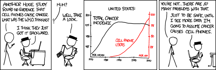
Ohhh! Perfect. Is this from you Dr. buddy? This is a perfect example of how misleading data can be. This is either (1) intentional disinformation or (2) generated by an idiot. In either case, it's incredibly misleading as presented. I have no idea if the data itself is accurate but it's irrelevant with the obvious problems. It's intentionally designed to mislead. First, let's all agree that our ability to handle infectious diseases greatly improved from 1850 to modern day. But these charts use that improvement to mask the impacts of vaccines by selectively choosing the scales and time periods.
The measles chart is atrocious. It stops at 1970 though the vaccine was introduced in 1963. In the 50's, you had something like 330 cases per 100,000. By 1980 you had 1 case per 100,000. You went from 500,000 cases per year and 500 deaths down to a few hundred cases per year. And with those infections come other complications besides death. If you were to look at this chart, you've learned absolutely nothing about the long term impacts of the measles vaccine. For evidence that the measles vaccine works (and it's not just general advancement nearly eradicating it) look at the examples I posted earlier in the thread.
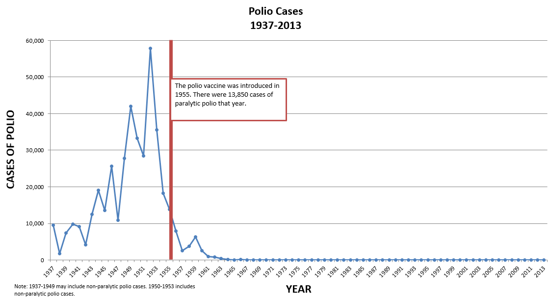
The Polio chart only shows 14 years and it ignores parlytic polio cases in favor of deaths. This creates the impression that we had mostly taken care of polio prior to the vaccine. Look at a more complete chart, from 1900 to present day and you'll have a far different takeaway. There was a major spike a few years prior to the vaccine and then a mean regression. At the peak, you had almost 60,000 cases of paralyzation (not death). There were over 13,000 paralyzations the year the vaccine was introduced in 1955. By the late 60's it was basically zero.
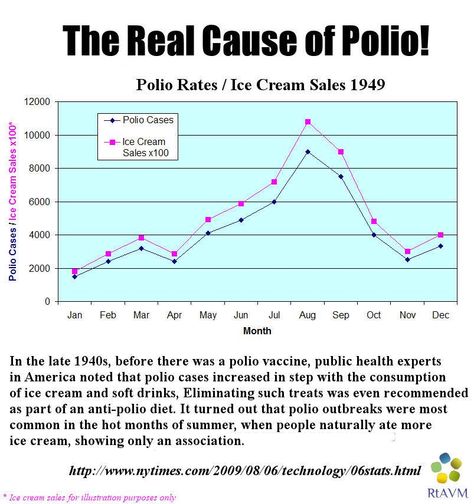
So yea this is (probably) accurate data framed to further a specific agenda.